Packaging Design for Meira Spices
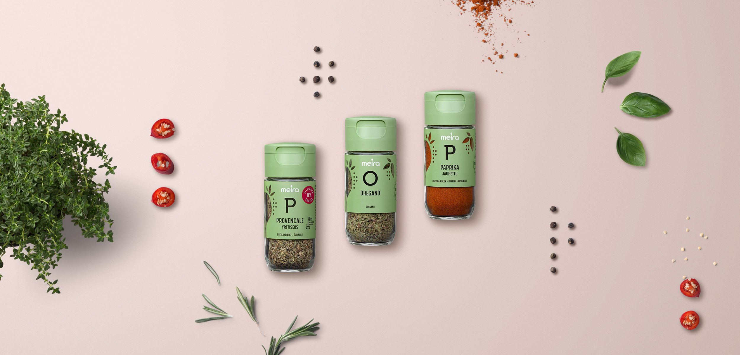
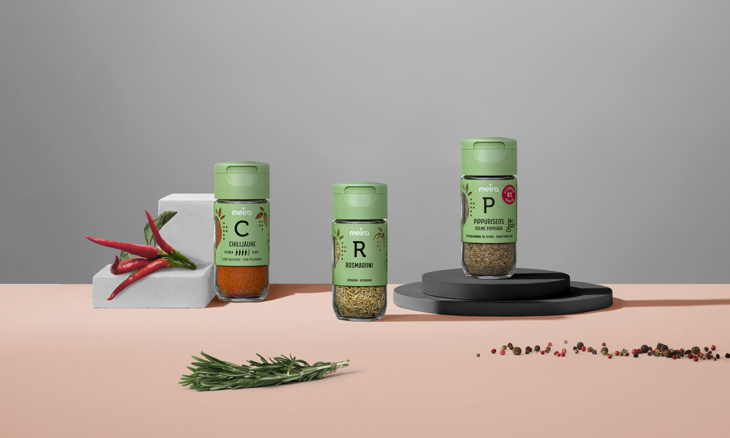
Meira’s brand promise is to use only the freshest high quality ingredients in their spices. The new design is highlighting the natural origin of the ingredients with a clean and harmonious layout that lets the tasty colourful spices shine.
The clear visual hierarchy of the design makes browsing of the vast ’spice library’ functional for both consumer and a professional Food Service user.
Furthermore, the contiguous design makes a strong statement how a visual design can take action towards evironmental awareness and responsibility towards more fluent packaging production.

Green that makes a difference
The new Meira’s green tone is carefully specified, custom colour outside Pantone guides, making sure that it gives all the different spices – from bright to more humble ones – a beautiful contrast.
The green shade has a joyful spirit yet being calmingly natural at the same time.

Going beyond user-centered design
Meira decided to give up text printing on site, starting to order the whole packaging material ready from the printer. This would have offered new opportunities to design product specific visuals and illustrations to highlight different products.
Instead it was clear from the start to expand the design focus beyond consumer-based thinking towards more holistic approach – including the technical knowhow of the whole packaging production operations to the visual design drivers.

Minimalism that matters
The illustrative window shapes playfully characterises freshness and different spices around a spoon element from the Meira logo – yet the combination is abstract enough to fit all spices.
The unified layout, along with minimal colours and thoughtful claim marking design, makes it possible to use the same printing plates and cylinders across the range – apart from the one product specific black text colour. This reduces the environmental impact of packaging production significantly compared to having product or even product group specific design features.
With Meira’s spice range extending to nearly 200 products, this also makes huge savings for the client in print start-up costs and optimizes procurement management for the upcoming years.


Scalable design
A cohesive design presents a clean slate and possibility to differentiate new interesting product launches from the collection for upcoming seasons.
For Food Service clients, the design has an additional dimension in variable background colours. Peppers, herbs, spice mixes and baking products are colour-coded in harmonious shades that deepen each group’s taste appeal and increase functionality in the busy professional kitchens.


